_picturing a year

Drawn to the big views, thinking about what it will be like to get all the way over there and look back, on January 1st this year, I sat at the shore and looked out to the horizon. Visualising, dreaming, designing, imagining, picturing; de-wording, seeing where to go. Making resolutions?

"Conquer the world and have a perfect love life."

Well, those are resolutions, I suppose, but they don't set anyone apart and I would have no better idea how to achieve them than marshall a wrestling match between Mary Berry and The Soggy Bottom Boys.

I've written about not making resolutions but creating objectives a few times over on Lightbox. For a few years, friends and I have helped each other reflect on the year past and set objectives for the coming 12 months. The objectives have helped us do some major things in life, with some colour. They are about taking a journey towards things that matter with solid mates whose opinion and respect you value.

Having a long view in mind, choosing objectives based on what that vision is, designing your way towards it and—crucially—letting other people in on it will stop life being monotone. Visualising this helps find courage to push at new doors to see which ones will fling open.


Using pictures to visualise the year ahead works, and I want to encourage you to do it.

Here are some ideas, if you're wondering where to begin:

  • Grab a huge piece of paper and draw images/tear pictures from mags to represent your vision; discover how things are connected and design pathways between them. If it's too personal to stick on the wall, roll it up and stash it for review in 6 months' time.
  • Make a Pinterest board to focus you on a project. Be specific, and make it real by designing tasks that relate to the things you have collected. I don't use my boards nearly enough but there is a link between them and this:
  • Choose a picture this week, and pin it above your desk. Tell someone about it, and why you chose it. Let it be something that carries an attitude (eg. patience, courage, generosity) and remind you why you keep on with your journey at all. Hockney helps me currently - I wrote about that too.)
  • Photographs are there for most of us, but be intentional - edit and print them! Put together a screensaver to absorb from time to time, or set yourself a visual blog project.

Life's path is far from straightforward. Enduring through inevitable fierce gusts and lumpy swell, will we be able to look back over that sea in time and say, Yes, I navigated well? Don't be afraid to accept if the horizon keeps moving and the navigation needs a redraw.
Let pictures help you find your way this year - focal points that remind you often why you choose to travel towards those things in the first place.

Have a really happy new year people.


* and btw, music does it too:

{Today's Soundtrack: Tom Odell - Sense}
_sweet christmas greetings

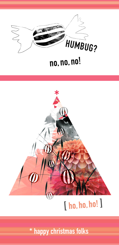
Many of you reading this have been a really big part of this massive year at Lizzie HQ so I'm sending you huge Christmas cheers in this seasonal post! Here's raising a little glass of sweet sherry in your direction and (as is my insatiable habit) coming over a little reflective while looking back on a year packed with change and surprise (must be the shiny baubles). For lots of people, there's a lot to take stock of. If you will, draw up to the virtual fireside and ponder while the festive tunes croon on in the background:
So, think back to this time last year. 

Can you say what is different today? What wheels have you set in motion in the past 12 months that weren't moving this time last year?


What books have you written, exhibitions mounted and speeches given, manifestos drafted and brave approaches made to new collaborators?

What chats have been had over the precious teacup as you sculpt projects and relationships, and after that, who has joined you on the journey, decided on a different path...

...or maybe even been born into your life?


Maybe it's not a person that's been born - maybe it's your Project Of A Lifetime.


And in the middle of all that, what things have stayed the same, necessarily so? Kept, preserved, treasured.


Could you name your favourite 3 places of the year, where things happened, and the people they happened with? Places and spaces come and go as theatre scenery. Don't forget your visual backdrops.


What have your soundtracks been?

Most of all, are you doing anything to mark and appreciate the changes? 

For all these things, there are plenty of reasons why the Christmas humbug could be tasting very sweet this year, so there's a special thing I want to do, thanks to you.

In October, I exhibited my Street Child photography project in Bradford Cathedral - the culmination of ten years work, which I think might have been the last show. It's a big deal to finish this project, but thanks to some of you there's plenty of new stuff happening. Learning when to finish something is a very good lesson - our identity can get so wrapped up in external things, but that's not always helpful when it's time to move on. To mark the changes, the end of the street kids project, and celebrate the positive impact many of you have had on my working life this year, my Christmas hospitality funds will be going to three charities: Save the Children, Barnardos, and Street Action. Lots of little people will also feel the impact too - and that's thanks to many of you who I have really enjoyed working with this year.
Thank you for being inspiring and bold and making things happen! So come on, with me and the kids, get with the humbug and sweeten up! 
A really HAPPY CHRISTMAS to you, and thanks everyone for a fantastic year.
Lizzie

_come on let me see you....

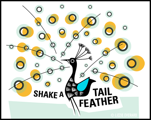
A little treat for you this week to get those tail feathers shimmying - I've made this illustration of a peacock in full flounce which you are free to download and use on your blogs.

When it comes to keeping up a blog I know it can be tricky to think of what to write about. I've been keeping my personal blog (Lightbox) for years, and it always starts with a photograph which sparks the theme. This approach has kept me going for nearly 300 posts, so I know how much good images can really help with writing ideas.

Also, from the visual communication angle, I am constantly applying lateral thinking to problems, and am fascinated with how one image can be interpreted in many different ways.

My hope is that this little bird will feather your nest with some ideas, but also that you can feedback here so we can all see how pliable and powerful good visuals can be.

There are loads of ways you could take this. Here are just a few thoughts:

• giving it all show & no content

• finding attractive prospects  

• how to perform a glistening presentation  

• giving your wide repertoire a shimmy (aka, plate spinning?)

....and I'm sure you could come up with more, about eyes/focal points, or ruffling feathers. Take it and make with it what you will!

Here's what to do:

1. Right click>save image as..., so it sits locally on your machine.
2. Use it in your blog post (out of courtesy, please credit/copyright check yours truly!)
3. Come back here and leave a link to your blog in the comments section, with any feedback on how your idea came about.
4. Tweet it! 

If your blog schedule is sorted for now, that's fine, bookmark it and keep it for future. I'll be sharing new images every now again so do check back if you are looking for some inspiration.

Happy writing!

_how to find a designer

There was once a time you could spot a designer at hundred paces (don't forget, we communicate visually) dressed in black, probably a polo-neck and goatee and that's just the girls. (In the BBC design team, my friend Penny and I used to fashion goatee beards from post-it notes, such was their innate power in the mid-90s to position you as a serious design contender.) Steve Jobs RIP has since ensured the black polo-neck and goatee are forever enshrined as the universal language for 'creative genius' and we normal humans dare not dilute that now. No, things have moved on, so how do you know you're talking to a good graphic designer? Here are some clues from an industry insider who's been there and done it. Starting at the top:

> hair: Hoxton Fins have slipped during the receding years and facial hair now looks like Goldilocks had a fight with Papa Bear and a tub of honey. Any designer worth their salt has a big, grizzly, fluffy beard, or statement hair. Hair is the designer's motto.

> asymmetry: ...of the fringe or hemlines. It must be intentional. Unintentional asymmetry betrays total lack control. Unintentional asymmetry means your deadlines are at risk.

> acute fashion sense: look for labels and t-shirt slogans - think twisty drainpipe jeans and Kooples stripes teamed with deck shoes. I'm not talking Primarni here - looks are everything and budget fashion indicates a designer's inability to manage their finances and direct them where it matters. Budget fashion suggests your budget is at risk.

> size of head: an ego the size of Texas is crucial.

> studio gimmicks: only hire a designer who has your best interests at heart, as displayed by the quality of gimmicks in their studio. The electric guitars/massive amps, carpet putting greens, and ginormous fish bowls full of marshmallows are just because they want you to be relaxed and happy.

> attention to detail: actually this really is important. A scary ability to detect a badly kerned piece of typography from across the room is a big deal. This skill is the equivalent of smoothing your eyebrows - if left unattended, you may know something doesn't look quite right but can't put your finger on it. Initially, the designer's attention to detail may be evidenced in an OCD approach to desk organisation.

> music: actually, this one is serious too. The design community is really good at music, mainly because we listen to so much of it while colouring in all day.

> lingo: if a designer is self-aware enough to give you a bullsh*t bingo card before a big presentation, this is funny but only in an ironic way. Irony is good.

> irony: further evidenced in the knitwear being sported. Currently, animal motifs are bang on trend.

...and finally,

> creative mystique: my personal favourite. Intangible solutions and concepts that link to nothing you have been talking about are nothing less than pure creative genius. See previous note about head size.

Having said all this, don't listen to a word of it. The very first way you will know you are talking to the right designer is that they are concerned with getting to know you and your project ideas. We are just human beings, and our job is to help you communicate and be understood, so number one consideration is that you feel sure you can be heard. Does this person get you, and to a degree, do you get them? Developing a good working relationship with your designer could mean some really articulate visual messaging develops for your business over time. Even if you have no idea how to explain what you need or want, a good designer will help you figure that out without making you feel stupid or inadequate. This is their expertise, and doesn't come without a grounded work ethic.

Second, check their credentials. A biog page on their website and a few examples of work should give you a sense they know what they're talking about. The rest begins with a chat, possibly some good coffee.

Simply put, a good designer's expertise and company should be enough, whatever their hair looks like or however many marshmallows are on the coffee table.

If you would like to chat through how to breathe visual life into your project idea, drop me a line. Promise I'll leave the ironic knitwear at home.

_for the love of letters


Letterforms are lovely. They just are - luscious and lyrical, lively, laying out our bare-faced feelings in explicit detail with the power to throw you into a rage or make your eyes leak. I've seen them catch your eye, before you even realised what was happening!

Okay, this is sounding horribly nerdy of me, but after all it's my job to notice what catches your eye, and why, and I have seen time and again that people swoop on chunky pieces of typography before even reading what the letters say, and this makes me think about the power of those little shapes.


My friends at Valuable Content recently showed me a souped-up presentation they liked because it contained loads of 'fonty fun' (a phrase they've coined for the love of letters) and five minutes after flicking through it, even though I was still thinking about the clever 'playbill' layouts with a mash-up of retro fonts that kept us examining the pages I remembered nothing of the message itself. This, friends, is a communication fail. In that context, the message was so important but it was lost under a frilly, ego-centric designer's need to be noticed. Meow. I can say that, I've done it too.


The thing is, sometimes, letterforms don't need to say much beyond the surface because they speak loud enough just as they are. Context will tell you when this is alright to not care what the word says; the environment where you find the letterforms will tell you whether they need to read with explicit meaning and clear messaging, or just convey a flavour of something by their shape and form alone.

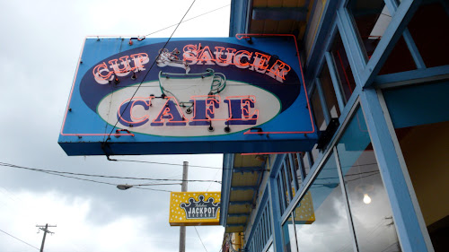
The photographs I've selected here are from a trip to Portland, Oregon. I made them because they conjured up the essence of where I was and the vibe around us, rather than what they explicitly said. These share a flavour of the streets and show the wallpaper of a fantastic trip full of ideas and culture and heartfelt chat.


Lovely aesthetics can be strong emotional magnets in the same way that a piece of music can strike deep without apparent reason. It's worth being aware of that stickiness when we're casting our glances about, looking for inspirations and information, thinking of how we communicate our own messages.

There can be more to your messaging through informed use of good typographic design, because we long to communicate with truth, integrity and maybe too the courtesy of allowing others to respond.

But, for the love of letters, have fun playing.

It can take a lifetime to get right, because letterforms have the power to express things you can't put into words.


LIGHTBOX HAS MOVED

Hi people. I am having a refresh of all my blogs and have moved LIGHTBOX to this link. Please update your bookmarks and feeds! I'll be using this site to test out some ideas for my Visual Communication projects, so watch this space for new ideas on 'Thinking Made Visual'!

Thanks,

Lizzie