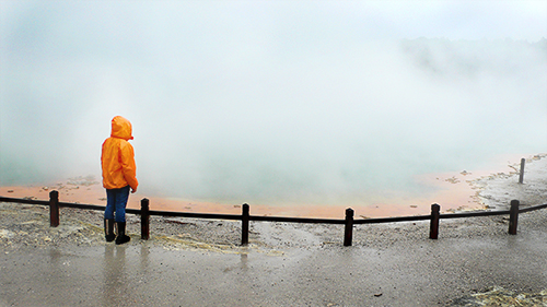
There's something I love about looking out at a foggy view. This picture always helps me remember one particular time – the fog over this extraordinary mineral pool had me hypnotised for ages, only occasionally able to pick out more or less of the bright orange and green.
Patient, watching, waiting for moments of clarity.
Back on home ground, this morning I was walking to work and looked out at fog over Ashton Court - a big old manor estate just on the edge of Bristol. It happened again. The view seemed flattened, but in that visual peace suddenly things felt calm in my mind too, and I was able to pinpoint a couple of thoughts I'd been struggling to grasp. Space to think.
In the fog of my mind, a couple of tiny focal points shone, and I was able to lock on to those. My path ahead straightened up.
The point is, in a fog, finding a focal point can be a very beautiful thing. And it works with design, sometimes very powerfully.
Creating key focal points with typography or illustration is so precious for pointing the way to your audience, through what can be—to them—a fog of information.
I think there are many things good design can help with, but for me, one of the main things is to communicate a message clearly and directly, and help people find their way to the things they need. Providing clear focal points and helping people discern their way through fog is one of the most brilliant and beautiful things you can do...
...and we all like a bit of helpful, brilliant and beautiful, right?


